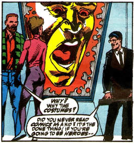
Meaning we get to meet some new heroes in ISSUE 302.
Plus, a new Autobot in the 1990 ANNUAL.
And some very odd specials in the 1990 COLLECTED COMICS.
It's all quite, quite magnificent.
| The Solar Pool |
|
 This week, it's the end of 1990! Meaning we get to meet some new heroes in ISSUE 302. Plus, a new Autobot in the 1990 ANNUAL. And some very odd specials in the 1990 COLLECTED COMICS. It's all quite, quite magnificent.
14 Comments
Charles RB
23/2/2018 03:50:59 pm
Magnificent Six is brilliant - and does seem to be the missing link that gets us to Wreckers, with its torture and shameful dark deeds of the past.
Reply
I love The Magnificent Six. It made a huge impression on me as a kid, and the introduction of Megadeath (that name! that look!) blew my mind. The way the classic heroes were evolving (exemplified by the AtoZs) also tapped into the feeling that the comic was maturing along with its audience, acknowledging the passage of time and events.
Reply
Ryan F
23/2/2018 09:14:48 pm
It’s like Furman didn’t learn anything from Circuit Breaker’s original appearances, or indeed RAAT. Stupid humans getting confused and treating all Transformers as hostile is just such a boring way of adding extra ‘drama’ to a situation. It just cheapens the Transformers to see them bested by such crap opposition. Transformers have gone toe-to-toe with Unicron, Death’s Head, time rifts, Demons and whatever else, yet run away screaming when attacked by, er, a guy with giant feet? At least maybe the Neo Knights going down like a lead balloon would make Furman think twice in future, yes? (Remembers Skywatch and Circuit Smasher) oh bugger.
Reply
Charles RB
23/2/2018 10:01:25 pm
It makes sense in IDW, where the Autobots are foreign infiltrators that don't talk to humans and - as he had VP Allen note in the Titan run - would just look like two imperial powers feuding over us. Marvel, not so much when the Autobots repeatedly go out of their way to talk to humans, save humans, and not fight humans. But that's the Marvel way ever since Spider-Man, so here it is again!
Reply
23/2/2018 09:27:18 pm
By presenting a government back team of mutants, this issue predates X-Factor by about a year (although Freedom Force had been around a while, but was largely portrayed as antagonists). And with Image comics only a few years away, it's not surprising that derivative teams and ideas were coming to the forefront. At the time I read this I was completely unfamiliar with Marvel mutants (this was around the end of the period when Marvel UK didn't do any superhero titles, and even the two annuals shown here are a step up) and found this story somewhat hard to understand because it never fully explained how the team got their powers. It was also difficult to realise the Air Strike Patrol got killed off in this one, with the art just compounding the problem.
Reply
Simon Hall
24/2/2018 10:08:42 am
Thunderpunch's speech pattern annoys me, ay? Like he's some broad Yorkshireman instead of... whatever he's supposed to be, The Neo Knights (really?) were just terrible. And so deserving of some extremely sketchy art to compound how rubbish they are (I didn't know the Air Strike Patrol died here either). Furman does do good work with Circuit Breaker though for the rest of the books' run and I actually don't mind the character. I do wonder why Marvel never did anything with her. She would have made a neat Iron Man villain, if nothing else. I suspect she's just been forgotten about and doesn't have the kitsch appeal of some of Marvel's other z-listers to warrant a revival (hello Squirrel Girl).
Reply
Paul Moseley
24/2/2018 09:35:32 pm
Isn't Thunderpunch Canadian? Hence the accent.
Reply
Felicity
24/12/2019 05:02:11 am
It’s a testament to how inaccurately Canadians have been portrayed in comics and other media that I (a Canadian) can’t tell if you’re serious or if you’re making a clever reference to the way that Wolverine has been written with an Australian accent in both comics and video. ☺
bouncelot
24/2/2018 02:31:06 pm
Are you sure that The Human Factor is the worst art in the series? I've always had that one down as The Big Broadcast of 2006 (UK-exclusive framing sequence excepted, of course).
Reply
Cosmic Horse
24/2/2018 08:22:42 pm
I am happy to go on record and say i quite like Dway Turner's art here. It's chunky and dark and has a spontaneous quality that's lacking in most of the U.S. art. I much prefer his stuff to the majority of Delbo's for example. Still, I'm aware I'm in the minority. Bunch of philistines.
Reply
Cosmic Horse
24/2/2018 08:24:09 pm
That image of the computer screen is terrible, mind.
Ryan F
24/2/2018 08:25:41 pm
I quite like it, too. It’s dark, broody and atmospheric. It adds a bit of gravitas to a script that barely deserves it.
LKW
7/10/2018 07:02:18 am
While there are certainly some bad panels on display here, I would also take Turner over Delbo, aka the-most-godawful-artist-ever-to-work-on-TF-comics (though Will Simpson might want to argue that), Cosmic Horse.
Felicity
24/12/2019 04:49:06 am
“Comfortably the worst art on the entire series”? No way. I can think of much worse. Frank Springer, Alan Kupperberg, Mike Manley, and Andrew Wildman have all turned in much worse work than Dwayne Turner at some point.
Reply
Leave a Reply. |
AuthorStuart Webb. Who knows everything about nothing and not a lot about that. Archives
July 2024
Categories
All
|