The Solar Pool
Follow Me For Updates On:
  • Blog
  • Revisitation
  • Transformation
  • Book Shop
    • Heart of the Pool
    • Disclaimer
    • Links

Transformation 174: Fruity Maximus

11/9/2015

46 Comments

 
Picture
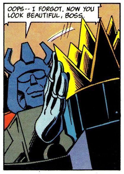
It's the start of the resolution to the plot we'd all forgotten: Grimlock's evil leadership Vs Fortress Maximus!

All in my look at Totalled Part 1!

Also, check out the new Podcast Maximus, which I'm somewhat involved in and covers all things Transformers.


46 Comments
Cradok
11/9/2015 03:06:08 pm

Anything involving 'King' Grimlock makes my brain hurt. Thank Primus is's nearly over and will get quietly put in the bin, until Furman fetches it out again in thirty issues. 'Rebel' Blaster thankfull joins him in said bin.

That group shot is interesting for a number of reasons. Firstly, no Protectobots, and they won't turn up again until G2. At this point, they're probably still on the run from Grimlock for doing Autobotty things, but after this... Deactivated off-panel is probably the most reasonable explanation. The panel is also the first appearance of loads of Autobots who've been missing in the US since Prime got his head back, although they'd have sporadic appearances in UK issues until around the time of Target 2006. And Sunstreaker is there, dead since aaaaaallll the way back to the end of the original mini. Of course, most of them won't survive long anyway...

Other than the usual Yomtov block colouring and miscolouring - that's Fireflight down the front coloured like Skydive, actual Skydive is up beside Not-Skids - there's also an example of a Delbo staple. The guy with the shoulder cones in the back row beside Tracks is actually Slingshot, but because his character model is from a low three-quarters angle, it looks there like his nosecone is on his shoulder, so Delbo put it there, and put another one on to make him match. Based on this, and a number of other things, I don't think Delbo ever had the rear angles for anyone. In fact, he probably just had a copy of Universe instead of actual character model guides.

(Fun fact, back in the early '00s, I attempted to compile a complete listing of every appearance of every Transformer in the comics, including noting character status, mistakes, speaking or non-speaking and when a character died or was brought back. I managed, with a lot of referencing character models and some advice from ATT, to get the US run completed. It kinda broke me, though, and I never finished the rest. But it does mean that I can still look at a panel and identify who's actually in it, regardless of being off-model or badly coloured.)

Reply
snowkatt
11/9/2015 04:23:54 pm

do you still have that list ?
despite it being "just" the US run it might still be very interesting
even in the US run its very easy to lose track of characters

and personally i stil think delbo's art is quite good better then the previous 2 comics its mostly yomtov's anemic block coloring that lets everything down

a good colorist can make all the difference
im sure you have seen the recolored pages of dark creation which look like a world of difference compared to the color book colorings by yomtov in the original http://img09.deviantart.net/575a/i/2006/111/6/f/thunderwing_pg_9_by_dcjosh.jpg
http://dcjosh.deviantart.com/art/TF-65-pg-15-32085265

look at that the difference is like night and day

were this comic handled by a different colorist like gina hart or euan peters it would look amazing instead of pedestrian
oddly enough yomtov does seem to get better later on with delbo's pencils and his color work looks fine under wildman and baskerville but senior suffers a lot

another example of how much difference a different colorist can make
http://robot6.comicbookresources.com/wp-content/uploads/2013/12/miracleman-1.jpg

granted miracleman is a exceptional comic and garry leach and exceptional artist
but the earth in the 1985 original is fricking PURPLE ! and the moon is orange !
steve oliff's color work lend the whole thing a more naturalistic realistic look which fits very well with leach's realistic art style

but a good colorist can make good art sing
http://dcjosh.deviantart.com/art/Geoff-Senior-TF-page-199431023

Reply
Felicity link
10/11/2019 01:54:02 am

It would be nice to see what the G1 comics would look like with every character coloured individually instead of in block colouring, but I’m not sure I like the colouring shown in those samples. For one thing, line art works better with flat colours rather than with Photoshop-y effects that use blurring and glowing and gradients. Also, in the scenes on Vsqs, the fact that some panels were entirely in pink was an important bit of mood lighting, not just laziness from Yomtov. It would be one thing if the re-colourist had re-coloured the panels in shades of pink, but colouring all the panels the same cold colours eliminates the mood lighting.

Tim Roll-Pickering link
13/9/2015 10:34:19 pm

It's fashionable to dismiss Grimlock's leadership as a total disaster but getting the Ark flying again and virtually all the Autobots back online is quite an achievement.

But agree with a lot about the colouring - this story and Spacehikers are both pains with loads of unclear Autobots that has led to online arguments.

Reply
Ryan F
11/9/2015 07:14:11 pm

Yes, I too would be interested in seeing Cradok's list. It would be a lot easier to compile such a list these days (thanks to that 'Ark' book of character models), but there are still some guys I can't identify!

Although 'Totaled' was the only TF story title to get Britished-up, there was a GI Joe story later on, 'Maneuvering for Position', that had its name changed in the UK Transformers comic.

After Furman stopped being editor, Euan Peters seemed far less interested in all that editing malarkey, and there are some U.S. Strips that go completely unchanged, complete with 'honor', 'travelers', and screwy '*as seen in issue #24' captions.

Reply
Cradok
11/9/2015 09:15:30 pm

If I do still have the lists - actually Excel sheets - they're on a hard drive from three PCs back that's been pulled and is in a box with all its unlabeled friends. I do intend to someday go back and retrieve everything from those drives that's actually important... but that won't be today, I'm afraid. The Generations guidebook was a big help, as were Doug Dlin's Cybertronian guides and the Transmanuals. The Transmanuals even had back views of the toys, something which is pretty hard to find even today. Nobody wants to take those pictures. And I actually told an inadvertant lie before, I can't quite look at *any* panel, I'd forgotten that Headmasters exists.

Reply
Ryan F
11/9/2015 11:49:17 pm

@ Cradok, can I just ask, do you recognise the Autobot in the very top-right on panel 1, page 20 of 'Spacehikers'? We only get a side-on view of his head and I don't have a clue who he is. Cheers!

Reply
Ryan F
11/9/2015 11:50:08 pm

Oops! I mean, top-left!

Reply
Cradok
12/9/2015 08:44:24 am

That's just Twin Twist again. The cheekguards and 'hat-brim' are the big giveaways.

Reply
Simon Hall
12/9/2015 02:15:33 pm

Cradok, that's an amazing super-power to have and I am in complete awe :)

In terms of the colouring, its worth remembering that all US comics had similar rubbishy colouring until the 1990s. US comic colouring was historically hardly anything to write home about (save for the odd bit of effort for bookshelf format stories or that Spider-Man story about Kraven going mental and burying Spidey alive), with it having little variation on the four-colour process used from the 1950s upwards. What is interesting is how prevalent the Ben Day dot colouring became - ostensibly used to show shade, some colourists like Yomtov got totally the wrong end of the stick with the dots and used it to block fill areas, which is why it always looks crap.

By the 1990s, colourists like Gregory Wright were doing some great things with the limited palette available to US colourists, but it wouldn't be until computer colouring was used more widely there'd be any major improvement (for Marvel, this happened with their acquisition of Malibu Comics in 1995).

British colouring by contrast has always managed to look superior - largely because it was painted or used a wdie range of colour markers (I recall a Junior South Bank Show from 1993 all about Marvel UK which showed the process of comics production - shame this isn't floating about on the interwebs anywhere- demonstrating how they coloured comics).

Reply
snowkatt
12/9/2015 04:41:10 pm

oh i know that the color platte for american comics were limited but even in the 80's colorists were doing marvelous things with what they had

i could name the usual suspects now ( watchmen dark knight returns the killing joke ) but i wont
instead lets look at comics which were actually on the news stands and whose colorists did great things

such as richmond lewis who colored batman year one
and whose subdued earth tones fitted and accentuated the downbeat realistic storyline and art
http://goodcomics.comicbookresources.com/2014/10/05/year-of-the-artist-day-278-david-mazzucchelli-part-3-batman-405/

glynis wein in Sienkiewicz's new mutants run
she made his already outer world pencils look like they were partially pained
how much that was up to Sienkiewicz's art however is up for debate

anything with barry windsor smith which was usually a whirl wind of colors such as un canny x-men 205 http://goodcomics.comicbookresources.com/2014/12/12/year-of-the-artist-day-346-barry-windsor-smith-part-4-uncanny-x-men-205/

or weapon X which is also a nightmarish collection of colors that are all over the place and stil form a coherent whole
...like most of windsor-smiths art really

and i'd be remiss if i didnt mention daredevil born again
http://thelatestpull.com/2015/04/daredevil-born-again-review/
colored by christie scheele ( also credited as max scheele )
none of these can match the color palette of comics today

but these colorists endeavored to make do with what they got and they did very very well with a limited palette
the coloring shift happend in the mid 1980's
and lets not forget that steve oliff had been hand picked by otomo himself to computer color epic comics akira in the early 90's
and the color work still holds up very well
( better then most other early 90's computer aided color)

but its not the palette its what th colorist can and will do with it
cause even yomtov occassionaly rose to the challenge and produced great color work
usually when wildman and baskerville were on art duties

that purple earth and orange moon in miracleman 1 are inexcusable though

( lets not forget the paper quality which for the longest time was news paper quality or below and that didnt really help to make the colors pop )

Reply
Cradok
12/9/2015 07:22:15 pm

It's less a superpower and more that studying this stuff for hours tends to burn it into your mind.forever. And being obsessed with Transformers, that helps too...

I don't actually find the old style of colouring bad, when used well it could be quite effective, but bad colourists and awful paper tended to drag the whole thing down. Like snowkatt said, even Yomtov was able to pull out some good work at times, mostly in the back third of the run. In a lot of ways, I actually prefer the original colouring in the pages from Dark Creation that Josh recoloured. It's one of the issues that Yomtov is actually on his game. For one, Vs'Qs should really be purple and pink, the grey doesn't work for me. More seriously, the recoloured pages just look too busy for the lineart, with the complex colours and shading detracting from the elegantly simple lines. I'd love to see how Euan Peters would have coloured this stuff. I know that David Willis recoloured a half-page from All Fall Down at one point that takes the existing colour *style* but improves on it, but I can't find it at the moment, I suspect it's been lost to the wilds of the internet.

Reply
snowkatt
13/9/2015 04:22:29 am

the problem is that yomtov rarely tried
even as early as issue 5 which was made around 4 months after the initial mini series and by that time yomtov should have had a good handle on things but what do we get with the dead autobot spread ?

everybody is bloody miscolored or colored like gears or optimus
well there goes the impact

odd thing is that yomtov seems to made an effort for william johnsons two issues which look lovely by comparison ( and which are the best damn looking US tf comics for along long long time )
maybe some artist worked better to his strengths or he just prefferred certain artists

but at this point in the series he really should have had a handle on things and knocked it off with the damn block coloring

Reply
Tim Roll-Pickering link
13/9/2015 11:13:51 pm

As well as changing the general tone of those Dark Creation pages he's also over "correcting" some of the characters to look more like the cartoon versions. As someone who grew up on the comics to me Bumblebee should have a full yellow face and Jazz a blue not black helmet. Okay this isn't on the scale of FIBRIR but the distinct looks shouldn't be tampered with IMHO.

Reply
Simon Hall
12/9/2015 08:44:53 pm

Hmm...I'd argue that the likes of Watchmen and Batman : Year One fall into the 'special event' type scenario than being reflective of the vast majority of most US output at the time. Regular issues of Spidey and X-Men, for example, have a similar sort of colouring technique as Yomtov was using on Transformers, but this doesn't dimish the point made that there were some colourists out there doing good work, just that they were exceptions, rather than the norm (as Vertigo's early output will attest, being a strange mix of sludgy browns, shocking pinks and pale blues)

What is interesting about a lot of US colouring techniques is how much better they looked on newssprint stock. In some instances where issues have been collected for trades and reprinted on a higher grade of paper, there's a greater degree of 'flattening' of the colours. Take Sara Mossof's Transformers: Generation 2 work as an example. The colours have some nice shading and blending techniques (particualrly in #7) that are lost on the reprints Titan did - the colours are much more solid than on the original newssprint stock.Bizarre.

I'm also one for leaving the original artwork as it was, colouring and all. I'm mystified why IDW have gone to such lengths to recolour a lot of the old US Marvel stuff and why they thought that was necessary. That said, Marvel UK did recolour a fair bit of the late issues of the US book themselves (notably the Wildman stuff that starts in US # 69 up), presumably as UK creators were working on the US material, this would make it look a little more home grown than was actually the case.

Reply
snowkatt
13/9/2015 04:35:17 am

watchmen ? absolutely that was a 12 issues maxi series on high quality paper geared at adults
it was less likely to be found on the new stands and more likely to be found in comic shops which were rearing their head in the late 70's and really started to flourish with the indie black and white comic boom ( and then imploded when the comic investor bubble went burst in 96 but i digress )

batman year one however was a news stand comic it shared space with detective comics web of spiderman peter parker asm transformers and the rest in the 1987 line up ( including the last marvel star wars comics )
it carried the CCA seal and the 4 issues were batman 401-404
thats why i specifically mentioned them because they were standard news stand comics and showed what colorists at the time were capable off

and they were absolutely the exceptions but they were around and putting their limited palette to good use

im not so sure about that the colors look better on on news print stock i have quite a bit of comics from the 70's 80's and 90's and the late 80's and early 90's with their low quality paper easily look the worst with faded colors overlap artifacting and just plain ugly printing

and these are not just any comics they are mcfarlane's asm run and they are hideous
the nearly 1000 pages omnibus that collects all of these improves the visual clarity just by dint of being reprinted on better paper
the art is clear
whites are white
blacks are black i dont have to squint and look at smudges and through the fuzz to figure out what is what

as far as original art goes and touching it up im not a purist
if the color work was especially bad such as the eclipse miracleman comics ( i repeat a purple earth !) then i welcome a recolor especially from somebody like steve oliff who usually delivers stellar work ( his akira work for epic was uhh epic )

but if a company does recolor a reprint at least make the recolor stand out and fix the problems i had to check the tf wiki to see the minute changes idw made to the color job


Reply
Ryan F link
12/9/2015 11:37:56 pm

Just to err on the side of Yomtov... By this time, there were 250+ Transformers, plus alt modes, and that's not including triple-changers, headmaster / targetmaster partners, pretender shells, and so on. Transformers, more than any other book, was so much to take in. What other book had 500+ regular modes to colour?

Reply
Stuart
12/9/2015 11:47:33 pm

The colouring system of the time cearly does have its limitations, but Yomtov is responsible for by far the worst colouring I've ever seen on an American book using the "Dots" method. Even compared to something like Action Force (except of course for the issues coloured by Nel Yomtov).

Certainly Delbo's work would look better in black and white, just about every page from the American comic I've seen, included those from the fortnightly UK issues, looks better that way. Oddly some black and white ReGeneration One pages Stephen Baskerville is selling on Ebay looked much, much better than the colour versions as well.

On the other hand, and again it's understandable if he wasn't given full body reference material but just the Universe book, his art isn't that exciting or engaging to me. Characters tend to either stand in their Universe profile pose, or in their Universe profile pose but leaning backwards and pointing as if he thought he needed to make some change to make it less obvious but could only ever come up with the one. Later on this will result in some comical panels where it looks as if PM Prime's entire chest is about to fall off his waist.

Some of the bonkers original prints he was selling at London Film and Comic Con suggested he really enjoyed drawing Grimlock and big breasted women. Sadly the comic will let him do both these things, but not at the same time.

Reply
snowkatt
13/9/2015 04:44:40 am

have you ever read marvels essential line ?
the comics there are reprinted on news paper stock paper in black and white
and in some causes stripped of the gaudy color and the limitations of the color palette in the 60's-80's the art looks a lot better
a lot crisper

anyway personally i think delbo's art is just fine he overuses the stock universe poses an awfull lot but he usually works best when drawing organics ( matrix quest ) or damaged transformers ( those robo zombies ...brrr )

Reply
Tim Roll-Pickering link
13/9/2015 10:52:31 pm

I've certainly read one or two of the Essentials. ;)

Often the black and white has that effect - e.g. the Champions/Super-Villain Team-Up crossover from the late 1970s looks much better in the black & white Essential Super-Villain Team-Up rather than the colour Champions Classic trade and even the mid 1980s Web of Spider-Man feels stronger in colour. But later on there was a period when Marvel started making more use of colour as an integral part of storytelling that can leave the black and white a little hard to follow in isolation - e.g. some of the Whilce Portacio Punisher issues or Marc Silvestri X-Men from the late 1980s are a pain. There's an X-Men issue I've just read where four of the members go to a mall where they buy new clothes and get new hairstyles - i.e. they now look different - before fighting some Ghostbusters spoofs - and without the colour it can be a little hard to recognise the characters at times because they lack the usual identifiers that colour would have provided.

Even later on a lot of Marvel issues never had full separations - the latter half of the Essential Wolverine volumes have the colour burned in as greyscale which creates quite a different effect from separations.

Stuart
13/9/2015 12:05:18 am

@Ryan who was posting as I typed:

Sure it had a lot of characters. But the British colourists managed to get the right colours on the right characters with much more regularity despite the same challenge.

Reply
Cradok
13/9/2015 12:05:42 am

Yeah, Yomtov didn't just get things wrong, he just wasn't trying. I actually preferred the miscolours to the block colouring, because at least he was giving it a go. I mean, the colours on Fireflight in this issue's group shot are good, just on the wrong guy, and you can't really blame him too much even for that, because the Arielbots are basically just the same guy four times.

Reply
snowkatt
13/9/2015 04:50:53 am

remember the cover for US 35 ?
that damn thing was block colored all the way
its like he looked at the comic then the cover and went fuck it and reached for the nearest two bottles of paint

i dont care for the UK cover of 142 the poses are suspect and how the hell can bruticus hit defensor's chest when defensor is standing with his back to him ?
defensor should have faced bruticus and gotten a face full of train

frank springers art is actually better on the cover but its ruined by the block coloring
uk 142's cover is slightly better because the colorists could be arsed to actually color it properly

Reply
snowkatt
13/9/2015 04:59:22 am

anyway i think i waffled on enough about colors and colorists and how a good colorist can make good art great

as far as the comic at hand goes i think the art by delbo is perfectly fine let down by yomtov's crayons
the story it self is ....fluff
its mostly set up for tying off the loose ends of a story line that should have been tied up by now but at leats budiansky is adress it instead of glossing over it

and some bait and switching for the return of optimus prime
but again budiansky is adressing the logistics and i suppose it makes sense that steel haven's resources are depleted after upgrading fort max
repairing for max
building a new body for goldbug
and 6 pretender shells

this isnt budiansky's finest effort nor is it his worst ( those are still to come monstercon from mars cash and carnage and worse ...groan )

he still has a few good to great stories left in him ( the underbase saga mostly ) but fatigue is setting in

from the sound of it though furman started to grow weary of the constant influx of new transformers as well

Reply
John d. link
13/9/2015 09:14:06 pm

Rubbish colouring, yes, but I still loved the team photo of the autobots coming off the ark. An unexplained Inferno is in the isn't he? Where is Snarl? I thought he might have been the fight umpire, but that was (an off scale) omega supreme wasn't it? There was a team photo a whole back in a marvel uk story at Optimus primes "grave" wasn't there? I remember being unsatisfied with that one as there seemed to be loads of characters missing?

Reply
Cradok
13/9/2015 09:32:09 pm

That's Grapple, Inferno has wings and a nozzle flanking his head, and a Prime-like head crest.

Reply
snowkatt
13/9/2015 09:41:54 pm

yes there was that was uk 104 ( one issue before ...that one ie afterdeath ..urgh )
the turn up for prime's funeral was a bit low if i recall but i can find any pictures of the scene though

Reply
Benway
13/9/2015 11:06:59 pm

Well, the ones who didn't turn up to Prime's funeral probably didn't believe he was dead since he'd already pulled this stunt before.

Benway
13/9/2015 11:18:51 pm

Did anyone else reading at the time not care if Optimus Prime came back at this point? He'd been a terrible failure of a leader and spent most of his time being angsty, shouting at people and fake dying. At least Grimlock got The Ark to run on time. I didn't like Flapjack Mxyzptlk either, but anyone else as leader would have suited me.

Reply
snowkatt
14/9/2015 04:36:55 pm

i didnt care much for grimlock as a leader though
he might have gotten the ark to fly again ut what else did he manage to do ?

fuck all thats what
flipjuice maxistrap was not a better leader but a more interesting character because he was fed up with war and willing to step out by hook or crook
and then galen died and we got spikimus ho hum

forkface mediumrare became ineffectual and was pushed to the side after that

power master prime was actually quite good unfortunally this set in motion his dying and coming back to life habit
and these days its a joke
we dont even care about the deaths any more we just count the seconds till he comes back again
( lampooned in tfa with 75 seconds between death and coming back to life again )

i wonder why the writers still bother because we dont buy it anymore anyway
http://tfwiki.net/wiki/The_many_deaths_of_Optimus_Prime

including prime but i have ...isuses with prime anyway
too many humans too little autobots
there are 6 main characters and we know nothing will happen to them because they are the main characters every threat rings hollow

i miss the cartoons with large casts and where a war was an actual war with hunderds each side instead of a cast of a whole 12 name characters

okay rant over

Reply
Ryan F
14/9/2015 06:51:47 pm

Back on the subject of Yomtov, I think we should bear in mind that Transformers was always a title that sailed pretty close to the wind when it came to deadlines. Twice they had to print stock material (Man of Iron, Big Broadcast) when they missed their dates, and looking at some of the lettering credits (M. Hands, Hans IV, 'Janice Chiang and others') it would seem that a few others barely made it to press.

I wonder, was Yomtov rushed? Colours and letters are always the final elements to get done, and it's those two elements that seem to suffer the most in the American issues.

If I were Yomtov and was under those sorts of time pressures, it's understandable that background characters would get the shortest shrift. Get the main stuff done, then colour the rest if you get the time.

He's always maligned as being lazy, and that he block-colours everything, but was that a conscious choice, or was he compromised by timing issues?

I seem to recall reading that no Marvel comic featured an unplanned reprint under Jim Shooter's watch, until 'Man of Iron' happened, which would seem to indicate that Transformers was quite atypical in terms of how late they were getting the completed comic to the printers.

Reply
snowkatt
14/9/2015 07:50:54 pm

but even if the title was always late lets keep in mind that issue 4 was released on 4 dec 1984
issue 5 was released in feb 1985

thats almost 2 months and yomtov STILL miscolored the autobots in the spread

and he had no problems taking on the universe pages or the headmasters mini so i dont think time crunch was a problem

sara mossof managed to do a much better job of coloring then yomtov ever did

and chiang was a prolific letterer
https://en.wikipedia.org/wiki/Janice_Chiang
in fact quite a few of the first third of the US run were lettered by her
The Transformers #2-3, 10-15, 17-21, 23-30

Reply
Ryan F
14/9/2015 08:01:11 pm

My point with Chiang was that US#3, 'Prisoner of War' had letters credited to "Janice Chiang and Others", which meant that she had help from at least two other Marvel staffers, in order to get the comic completed in time.

And while the errors in #5 were unfortunate, this was a relatively new title - everybody was getting used to how the characters were supposed to look (and judging by the appearances of Megatron, Starscream and Soundwave in the earliest issues, there were at least two different colour references doing the rounds. Inconsistent art and a proliferation of generic background bots only added to the confusion.

Besides which, at least some of the blame should fall on the editor (which in the case of that issue, was Jim Owsley). It's his job to check through the issue, make sure everything's okay. The buck stops with him, surely?

Bouncelot
18/9/2015 05:03:28 pm

"I seem to recall reading that no Marvel comic featured an unplanned reprint under Jim Shooter's watch, until 'Man of Iron' happened, which would seem to indicate that Transformers was quite atypical in terms of how late they were getting the completed comic to the printers."

The Jim Shooter era featured loads of fill-ins, it was the method he ensured that the books shipped on time even if the creative team missed their deadline. But these were mostly stand-alone stories that had been specifically commissioned as fill-ins, rather than reprints of stuff that had previously featured elsewhere. Presumably Man of Iron only got to be a fill-in because it was a Marvel UK story that the Marvel US readers wouldn't have seen before.

Reply
Ralph Burns
14/9/2015 08:01:39 pm

I will defend Delbo and Yomtov until the heat death of the universe itself. And beyond!

In other news that ad has reminded me of the very short lived greatness of the Galaxy Rangers launch which died a very swift end despite being fabulous.


SPECIAL TEAMS!

Reply
Stuart
14/9/2015 08:08:35 pm

Well if the Galaxy Rangers themselves were out to stop people buying their comic it's no wonder it died a quick death!

I extenuating circumstances should be extended to everyone involved in the mini-series, including Yomtov. I'd agree with Snowkatt though that the messing up of the double spread is insanely poor.

Mind, the artist reusing the spread later in the same issue despite it looking worse when squashed into one page and it not making narrative sense (the Autobots have already been taken down at that point) is probably a worse fubar. At least with it split into two in the UK that was a fortnight apart.

Reply
Ryan F
14/9/2015 08:43:11 pm

Very diplomatic, Stuart!

Whilst I concede the point that Yomtov's colours are sometimes a bit shonky, it does sadden me to see that he's become a bit of a hate-figure, or at the very least a punch line, amongst Transformers fans.

So yeah, I make no apologies for trying to stand up for the fella!

Reply
snowkatt
14/9/2015 09:39:38 pm

just a bit ? ;p

make no mistake yomtov has done good work
usually when paired with johnson or wildmans art his color work is pretty damn great there

but that doesnt defer from the fact that most of the time he resorted to block coloring or just plain miscoloring the cover of TF US 35 is monochromatic there is nothing to it
that one was pure laziness

as for you point about the miscolored spread in US 5
this was not reallya new series anymore
the series was bi monthly so there was more then enough time to color the art without getting to much in to a time crunch

and by the time issue 5 rolled by yomtov had colored all 4 previous issues by now he should have had a handle on it

as far as 3 goes i dont think that janice chiang lettering one issue with help is a sign of terminal lateness

from what i recall US 33 and 34 were tf uk reprints because budiansky was working on the headmasters mini but dont take my word for that
its a bit hazy and i might be wrong
but it kinda works because the mini series merged with tf US 38

Reply
Cradok
16/9/2015 01:26:10 pm

I don't hate him, he's not Pat Lee, after all. But there is that old saying about delays not being remembered, only bad work. There are a number of his colouring choices that I quite liked, and he did sometimes use the block colouring quite well, but overall, even as a six year-old, I don't like his work.

Reply
snowkatt
16/9/2015 05:17:30 pm

i dont hate yomtov either
but as a colorists he wasnt really suited for transformers
the bad in his work overshadows the good even if he did excellent work on occasion especially with wildman\baskerville's pencils

its just that the UK colorists and sara mossof were on the whole better transformer colorists

do we actually know what else yomtov colored ?
i know he worked on marvels star wars title in the 80's
http://www.littlestuffedbull.com/images/2015/365starwars/0605-starwars37.jpg
http://bullyscomics.blogspot.nl/2015/06/365-days-of-star-wars-comics-day-156.html
and this is only a single panel but it looks like a world of difference with yomtov's TF work
and more of his non tf colorwork http://bullyscomics.blogspot.nl/2014/07/bear-attack-month-2014-day-12-welcome.html

so maybe yomtov really wasnt that suited for transformers
just the only one interested

Tim Roll-Pickering link
16/9/2015 06:16:36 pm

If this works this should show all known Yomtov credits:

http://www.dcindexes.com/features/creator.php?creatorid=4444

snowkatt
15/9/2015 11:09:05 pm

just a bit of colorist trivia about richmond lewis the colorist of year one
she is married to dave mazzuchelli https://en.wikipedia.org/wiki/Richmond_Lewis
and she mostly colored year one as a side project for her husband because she is primarily a painter
i didnt know any of that untill now

Reply
Andy Turnbull link
9/10/2015 06:08:42 pm

I shall be using my privilege to ensure that a robust defence of Yomtov is found in a future printed collection of Transformation.

The man had the most difficult gig in comics colouring bar none.

Also he had to do it as a monthly grind - many of the projects mentioned in other comments had much more generous lead time than he would be allowed and that includes Richmond Lewis's work on Year One.

That's not to say he would necessarily be better than some of the people listed given the luxury of time. I'd cite Barry Windsor-Smith and Kevin Nowlan to be two of the finest colour artists who could work with the techniques back in the 80's and I doubt he'd get anywhere close to them.

Also - he didn't colour any of the US covers. Marvel had a specific cover colour artist for most of the 80's and early 90's George Roussos. Hence why more than a few US covers had...interesting colour choices.

Reply
Ryan F
9/10/2015 11:09:52 pm

Andy, I completely agree.

One other point to note: Yomtov seems to have sought inspiration from the art. When Senior did the US comics, Nel produced some really excellent stuff. Dark Creation is a personal favourite of mine. Bumblebee in a half white, half lemon yellow was a master stroke. That would be the comic I show to anyone who has a hate on Yomtov. That and Bird of Prey. Senior really brought the best out in Nel.

Reply
Stuart
10/10/2015 08:02:21 pm

I should just like to say Andy's "Privilege" is not a euphemism.

Felicity link
10/11/2019 01:07:33 am

I’m glad it didn’t occur to Bob Budiansky to use this issue to kill off older characters. It’s sad when that happens. Remember that (a) every character is someone’s favourite, (b) the best visual designs tended to be in the original wave of characters, (c) it’s possible to just focus on a few characters at a time without killing off the ones not being used, and (d) often the old characters serve as anchors to help us accept the new characters.

[When I watched “Headmasters,” the Japanese animated series, I was pleased at first to see so many first-, second-, and third-season characters return (including some we were told had died off-screen, like Hound). As the series progressed, however, characters were either killed (like Optimus Prime) or shuffled out of the story and never used again so that we could focus on the new characters—and I never did warm up to the new characters.]

It is weird seeing Soundwave with a face but at least it’s a handsome face. The worst thing is when the artist misinterprets the facial “squiggle” in the “Universe” art (which I think was just supposed to be a highlight on his faceplate) as a jagged monster mouth, like some sort of “Jetsons” villain.

I’d still love to read that “Galaxy Rangers” comic.

IIRC those officers with Hawk at the Pit come from each of the branches of the forces, one Air Force general, one Army general, and one Navy admiral (hence the “batten down the hatches” line you quoted). There’s a nice scene somewhere in this issue where we get a sense of how scary and inhuman the BATs can be when they’re simply thrown over a high ledge down at the officers and whatever’s left of the BATs carries on fighting. Very Terminator-ish.

The cartoon would go back and forth on whether the BATs were this scary or not, sometimes having them be terrifying and other times making them nothing more than enemy soldiers you can destroy in large numbers without having killed a living human character. I was always partial to the scarier version of them, as it made it that much more impressive when the heroes stood up to them.

Reply


Leave a Reply.

    Author

    Stuart Webb. Who knows everything about nothing and not a lot about that.

    Archives

    February 2023
    January 2023
    December 2022
    November 2022
    October 2022
    September 2022
    August 2022
    July 2022
    June 2022
    May 2022
    April 2022
    March 2022
    February 2022
    January 2022
    December 2021
    November 2021
    October 2021
    September 2021
    August 2021
    July 2021
    June 2021
    May 2021
    April 2021
    March 2021
    February 2021
    January 2021
    December 2020
    November 2020
    June 2020
    May 2020
    April 2020
    March 2020
    February 2020
    January 2020
    December 2019
    November 2019
    October 2019
    September 2019
    August 2019
    July 2019
    June 2019
    May 2019
    April 2019
    March 2019
    February 2019
    January 2019
    December 2018
    November 2018
    October 2018
    September 2018
    August 2018
    July 2018
    June 2018
    May 2018
    April 2018
    March 2018
    February 2018
    January 2018
    December 2017
    November 2017
    October 2017
    September 2017
    August 2017
    July 2017
    June 2017
    May 2017
    April 2017
    March 2017
    February 2017
    January 2017
    December 2016
    November 2016
    October 2016
    September 2016
    August 2016
    July 2016
    June 2016
    May 2016
    April 2016
    March 2016
    February 2016
    January 2016
    December 2015
    November 2015
    October 2015
    September 2015
    August 2015
    July 2015
    June 2015
    May 2015
    April 2015
    March 2015
    February 2015
    January 2015
    December 2014
    November 2014
    October 2014
    September 2014
    August 2014
    July 2014
    June 2014
    May 2014
    April 2014
    March 2014
    February 2014
    January 2014
    December 2013
    November 2013
    October 2013
    September 2013
    August 2013
    July 2013
    June 2013
    May 2013
    April 2013
    March 2013
    February 2013
    January 2013
    December 2012
    November 2012
    October 2012
    September 2012
    August 2012
    July 2012
    June 2012
    May 2012
    March 2012
    January 2012
    December 2011
    November 2011
    October 2011
    September 2011
    August 2011
    July 2011

    Categories

    All
    Action Force/G.I. Joe
    Animated
    Announcement
    Armada
    Audio
    Avengers
    Baker
    Bay
    Beast Wars
    Big Finish
    Brosnan
    Cannon
    Capaldi
    Carpenter
    Carte Blanche
    Cartoon
    Combat Colin
    Comedy
    Comics
    Computer Games
    Costa
    Cullen
    Davison
    Death
    Discworld
    Doctor Who
    Dragon's Claws
    Dreamwave
    Dynamite
    Eccleston
    Ellis
    Fantasy
    Film
    Fleetway
    Frost
    Furman
    Generation 2
    Generation One
    Generation One
    Holmes
    Horror
    IDW
    James Bond
    James Roberts
    Jeffrey Deaver
    Ladybird
    Machine Man
    Marvel
    McCarthy
    Mccoy
    Mcgann
    Mosaic
    Nick Roche
    Nimoy
    Nintendo
    Panini
    Pegg
    Pratchett
    Prime
    Rescue Bots
    Revisitation
    RID
    Rincewind
    Science Fiction
    Science Fiction
    Shatner
    Signature
    Smith
    Sponsored
    Spy
    Star Trek
    Su
    Tennant
    Tipton
    Titan
    Torchwood
    Transformation
    Transformers
    Tv
    Visionaries
    Weatherwax
    Witches
    Wizards
    YouTube

    RSS Feed

Powered by Create your own unique website with customizable templates.